
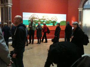
The first room of the exhibition took my breath away, and then the next room, and the next room and the next room. As soon as you walk in the colours of the paintings just vibrate off the canvas as a life force - its like Hockney has put together this complete vision of existence and colour.
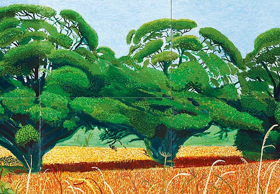
In the first room - with four paintings of Thixendale Trees at different times of year - these superb colours mean that even in the winter scene where the tress have stark shapes with no leaves you are left feeling a warm romanticism due to the way Hockney has used cozy blacks and cool blues. In contrast, with those same trees in the summer Hockney has communicated his vision of them as full and heavy, so heavy with leaves that each weighty branch becomes a living 3D shape.

The exhibition takes you right through from his really early student works that are imbued with much more classical, sombre British romanticism and have a feel of William Coldstream to his famous later student works and then the paintings of the Grand Canyon and Yorkshire.
I first saw the ones of Yorkshire in the 90s in the Pompidou Centre and was blown away by them then, and then saw the paintings of the Grand Canyon after that - but it’s the more recent paintings that are the best, and the way the exhibition is laid out helps you see how all the other works have led to these most recent pictures.
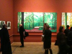
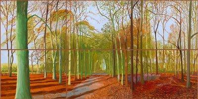
Probably my favourite room is of Woldgate Woods in different seasons, the colours are magical and if they can look too bright in reproduction then you need to see them in real life as then they just sing and reverberate. There’s a beautiful sizzling painting with autumn oranges, and probably my favourite painting of the whole show is the summer one where the greens are magnificantly hot and warm.

As an artist myself the only thing I found was that I was initially jealous, or didn’t know how to compete with the vast amount of work here, the clarity of vision and the sheer scale and ambition of the show. While juggling jobs and family it’s hard to get a day painting a week for myself - let alone the focus and time you can see Hockney has put into this. Maybe that’s why the show got a few rough reviews, jealous reviewers or people just bowed by the achievement.
The iPad pictures are also brilliant, probably my second favourite bit of the show. I didn’t even realise that they were were prints until I looked closely, they just seemed like paintings. The colours and clarity and especially reflections in them are amazing.
If there was anything that initially was not my favourite bit it was the Hawthorn pictures, they are just genuinely so weird that they are quite confrontational - but I’m warming to them the more I think about them. The paintings of a tree stump are even more bizarre, with one that at the bottom begins to look like a Patrick Heron abstract. It felt to me that Hockney was pushing and pushing in these stranger paintings through to some archetypal vision of communication.
If you love colour, painting and life you’ll love this show - don’t miss it.
Review by Robert Dunt, practising artist and Founder/CEO ArtTop10.com

Comments