Overall I enjoyed this year's fair - but as can often happen it all felt a but underwhelming at the beginning. Maybe it's just because there's so much to look at that it's difficult to decide where to start, but once you find something you like, you begin to get into the vibe.
It might also have been that I started in the supposedly more exciting project's space section but found it lacking. The more traditional art in the main section of the fair - that had mostly been painted years ago - still felt more relevant and exciting.
The project space seemed to be demanding a lot from the viewer without really offering anyting up first - there didn't seem much to draw you in. There were lots of digital prints and photos stuck on the wall here and there and after looking for a bit everything felt deriverative and the lack of materiality of all the print-outs and photos became repetitive and gave the section, a possibly unfair, feeling that it lacked depth - and for a project area was very non-offesive and not very radical.
But in the main section there were a lot of great works by modern and contemporary artists - have a look at the images below - these were what I found most interesting to look at, in no particular order.
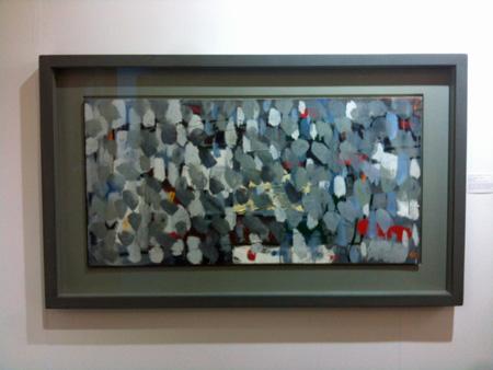
This is a great Patrick Heron called Leaves from 1956 that the Redfern Gallery had on show. I'd never seen this one before - the bright colours that he is probably known for are hidden here behind grey blobs of paint. I was really excited by this one as it reminds me of my own Distortion Form paintings.
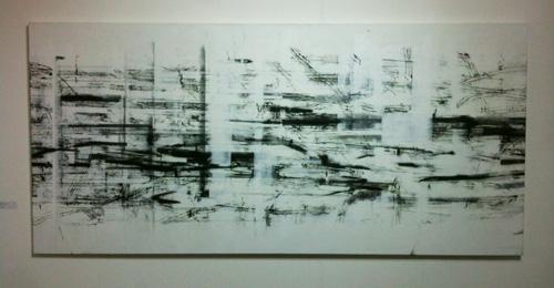
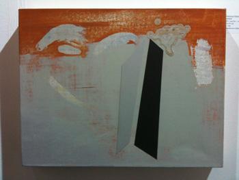
A really good painting by the contemporary artist Kate Palmer shown by the Broadbent gallery. I really liked the way she'd used white columns to almost blot out the intricate lines underneath - somehow these white columns made the piece feel as if it was flickering like a film.

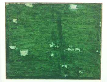
A great painting called Uncomeliness by contemporary artist Clyde Hopkins shown by Advanced Graphics - beautifully painted, even each little blob has been put in with real care and attention and there's some lovely brushwork.
I liked this painting by contemporary artist Andrew Vass that was on show at the Broadbent gallery. Titled Park Edge 3 I really liked the brushstrokes - like a contemporary and intensely resrained Patrick Heron.
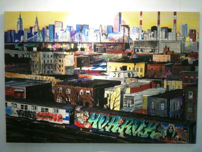
This was a typically funky and exciting painting by contemporay artist James Jessop at the Charlie Simth gallery - called Valley of Horror - check out the great grafittied train in the bottom right!
I really liked the way that the collaged pieces on this painting, by contemporary artist Francesca Simon at the Beardsmore gallery, left tiny shadows down the edge of the collaged material that looked like very carefully drawn lines.
It's definitely worth going to the London Art Fair this year - but be prepared to put some time in to find the paintings that will make it worthwhile for you.