If I could take these pictures home they would work a lot better. They need the chance to be looked at for a long time, and for you to take them by surprise.
I was sitting in front of this one called ‘Primrose Hill, Spring Sunshine’ answering emails on my phone and when I looked up I could suddenly see all the subtly of the way he'd painted the tress and the sky behind. When you firstly look you don't get that. You get the physicality and the chunkiness of the lines. But suddenly looking at it without warning I caught it and saw the subtly of those chunky lines.

Primrose Hill, Spring Sunshine 1961-2/64
Head of E.O.W. II is another classic. It looks like a 3D still from a film and the depth of paint adds to that filmic sense.
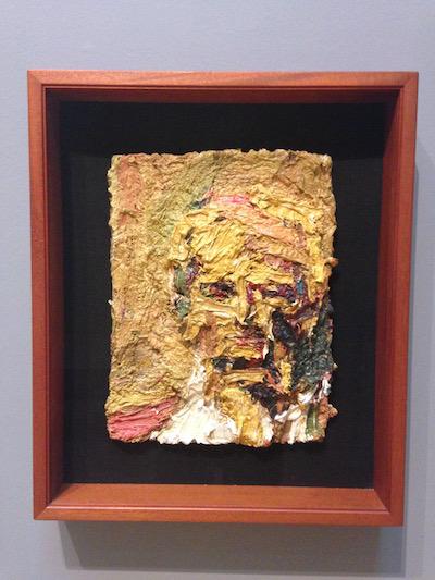
Head of E.O.W II 1961
When so much art is a tattooed dog with a lightbulb jammed in its mouth, or just a film of that, there's gravity in seeing someone who has battled with paint and painting for such a long time. It's easy to forget that groundbreaking ideas like cubism did just emerge from painting, but nevertheless changed the way we think about seeing.
At the press view one of his sitters explained how Auerbach was not still while painting them, but would wander around muttering to himself and looking at them from all sides, which has an interesting cubist link.
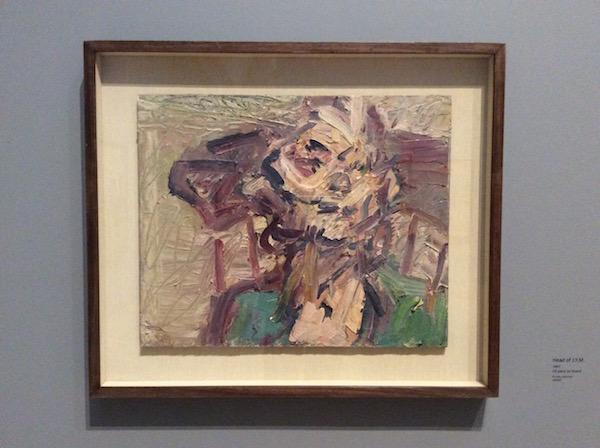
There are some paintings with beautiful colours hidden in here such as Head of JYM from 1997 (below). There is also a sense sometimes of, dare I say, sludge. But perhaps there’s some magic in turning that into something surprising and beautiful. There’s a sense that the weight of the paint is almost nostalgic in itself and as I went home on the train the grey London day seemed rather beautiful.
But mainly the paintings surprise you. You almost need to turn around quickly and then you're suddenly hit by them.
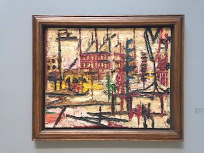
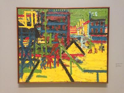
One moment you're looking at Mornington Crescent from 1965 which is a bit grey. But a beautiful creamy grey with pinks and browns and then bang! You turn around and there's another pic of Mornington Crescent from 1967 that is just mad - all bight yellow.
A very surprising show.
Review by Robert Dunt, Founder & CEO ArtTop10.com www.robertdunt.com